Content
<style>* {padding: 0;margin: 0;box-sizing: border-box;}.container {font-size: 1.5rem;display: grid;background-color: beige;padding: 5px;grid-template-areas: "header header header" "content content sidebar" "footer footer footer";grid-template-rows: 10vh 40vh 10vh;grid-gap: 10px;width: 100%;margin: auto;text-align:center;}.navbar {grid-area: header;background-color: brown;}.mainarea {grid-area: content;background-color: cadetblue;}.sidebar {grid-area: sidebar;background-color: chocolate;}.footer {grid-area: footer;background-color: crimson;}</style><div class="container"><div class="navbar">Header</div><div class="mainarea">Content</div><div class="sidebar">Sidebar</div><div class="footer">Footer</div></div>
CSS Grids
Display Property
An HTML element becomes a grid container when its display property is set to grid or inline-grid.
Example:
.grid-container {
display: grid;
// display: inline-grid;
}
Grid Gaps
The spaces between each column/row are called gaps.
You can adjust the gap size by using one of the following properties:
grid-column-gapgrid-row-gapgrid-gap
Example:
.grid-container {
display: grid;
grid-column-gap: 50px;
// grid-row-gap: 50px;
}
Example:
The grid-gap property is a shorthand property for the grid-row-gap and the grid-column-gap properties:
.grid-container {
display: grid;
grid-gap: 50px 100px;
// grid-gap: 50px;
}
The grid-gap property can also be used to set both the row gap and the column gap in one value:
Grid Container
To make an HTML element behave as a grid container, you have to set the display property to grid or inline-grid.
The grid-template-columns Property
The grid-template-columns property defines the number of columns in your grid layout, and it can define the width of each column.
The value is a space-separated-list, where each value defines the width of the respective column.
If you want your grid layout to contain 4 columns, specify the width of the 4 columns, or "auto" if all columns should have the same width.
Example:
.grid-container {display: grid;grid-template-columns: auto auto 200px 30% 1fr 2fr; //units :fr,px,em,vh}
The grid-template-rows Property
The grid-template-rows property defines the height of each row.
The value is a space-separated-list, where each value defines the height of the respective row:
Example:
.grid-container {display: grid;grid-template-rows: 80px 200px;}
The justify-content Property
The justify-content property is used to align the whole grid inside the container.
Note: The grid's total width has to be less than the container's width for the justify-content property to have any effect.
Example:
.grid-container {display: grid;justify-content: space-evenly; //values:space-around,space-between,start,end,center}
The align-content Property
The align-content property is used to vertically align the whole grid inside the container.
Note: The grid's total height has to be less than the container's height for the align-content property to have any effect.
Example:
.grid-container {display: grid;height: 400px;align-content: center; //values:space-around,space-between,start,end,center}
Grid Items
Child Elements (Items)
A grid container contains grid items.
By default, a container has one grid item for each column, in each row, but you can style the grid items so that they will span multiple columns and/or rows.
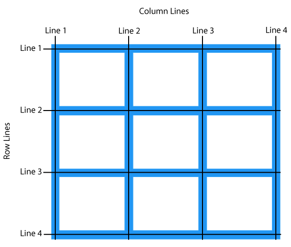
The grid-column Property
The grid-column property defines on which column(s) to place an item.
You define where the item will start, and where the item will end.
Note: The grid-column property is a shorthand property for the grid-column-start and the grid-column-end properties.
Example:
.item1 {grid-column: 1 / 5;grid-column: 1 / span 3; //Make "item1" start on column 1 and span 3 columns}
The grid-row Property
The grid-row property defines on which row to place an item.
You define where the item will start, and where the item will end.
The grid-row property defines on which row to place an item.
You define where the item will start, and where the item will end.
Note: The grid-row property is a shorthand property for the grid-row-start and the grid-row-end properties.
Example:
.item1 {grid-row: 1 / 4; //Make "item1" start on row-line 1 and end on row-line 4grid-row: 1 / span 2; //Make "item1" start on row 1 and span 2 rows}
The grid-area Property
The grid-area property can be used as a shorthand property for the grid-row-start, grid-column-start, grid-row-end and the grid-column-end properties.
Example:
.item8 {grid-area: 1 / 2 / 5 / 6; //Make "item8" start on row-line 1 and column-line 2, and end on row-line 5 and column line 6
grid-area: 2 / 1 / span 2 / span 3; //Make "item8" start on row-line 2 and column- -line 1, and span 2 rows and 3 columns}
Naming Grid Items
The grid-area property can also be used to assign names to grid items.
Named grid items can be referred to by the grid-template-areas property of the grid container.
Example:
Item1 gets the name "myArea" and spans all five columns in a five columns grid layout:
.item1 {grid-area: myArea;}.grid-container {grid-template-areas: 'myArea myArea myArea myArea myArea';}
Each row is defined by apostrophes (' ')
The columns in each row is defined inside the apostrophes, separated by a space.
Note: A period sign represents a grid item with no name.
Example:
Let "myArea" span two columns in a five columns grid layout (period signs represent items with no name):
.item1 {grid-area: myArea;}.grid-container {grid-template-areas: 'myArea myArea . . .';}
.item1 { grid-area: header; }.item2 { grid-area: menu; }.item3 { grid-area: main; }.item4 { grid-area: right; }.item5 { grid-area: footer; }.grid-container {grid-template-areas:'header header header header header header''menu main main main right right''menu footer footer footer footer footer';}
The grid-template Property
The grid-template property is a shorthand property for defining grid columns, rows, and areas.
This property is a shorthand for the following CSS properties:
grid-template-areasgrid-template-columnsgrid-template-rows
Syntax:
grid-template: "header header header" 20%"content content content" auto"sidebar sidebar" 100px 1fr / 50px 1fr; //'item area name' column / row