HTML - The Head Element
The HTML <head> element is a container for the following elements: <title>, <style>, <meta>, <link>, <script>, and <base>.
The HTML <head> Element
The <head> element is a container for metadata (data about data) and is placed between the <html> tag and the <body> tag.
HTML metadata is data about the HTML document. Metadata is not displayed.
Metadata typically define the document title, character set, styles, scripts, and other meta information.
The HTML <title> Element
The <title> element defines the title of the document. The title must be text-only, and it is shown in the browser's title bar or in the page's tab.
The <title> element is required in HTML documents!
The contents of a page title is very important for search engine optimization (SEO)! The page title is used by search engine algorithms to decide the order when listing pages in search results.
The <title> element:
- defines a title in the browser toolbar
- provides a title for the page when it is added to favorites
- displays a title for the page in search engine-results
- So, try to make the title as accurate and meaningful as possible!
The HTML <style> Element
The <style> element is used to define style information for a single HTML page:
Example:
<style>body {background-color: powderblue;}h1 {color: red;}p {color: blue;}</style>
The HTML <link> Element
The <link> element defines the relationship between the current document and an external resource.
The <link> tag is most often used to link to external style sheets:
Example:
<link rel="stylesheet" href="mystyle.css">
The HTML <meta> Element
The <meta> element is typically used to specify the character set, page description, keywords, author of the document, and viewport settings.
The metadata will not be displayed on the page, but are used by browsers (how to display content or reload page), by search engines (keywords), and other web services.
Examples:
Define the character set used:
<meta charset="UTF-8">
Define keywords for search engines:
<meta name="keywords" content="HTML, CSS, JavaScript">
Define a description of your web page:
<meta name="description" content="Free Web tutorials">
Define the author of a page:
<meta name="author" content="John Doe">
Refresh document every 30 seconds:
<meta http-equiv="refresh" content="30">
Setting the viewport to make your website look good on all devices:
<meta name="viewport" content="width=device-width, initial-scale=1.0">
Example of <meta> tags:
<meta charset="UTF-8"><meta name="description" content="Free Web tutorials"><meta name="keywords" content="HTML, CSS, JavaScript"><meta name="author" content="John Doe">
Setting The Viewport
The viewport is the user's visible area of a web page. It varies with the device - it will be smaller on a mobile phone than on a computer screen.
You should include the following <meta> element in all your web pages:
<meta name="viewport" content="width=device-width, initial-scale=1.0">
This gives the browser instructions on how to control the page's dimensions and scaling.
The width=device-width part sets the width of the page to follow the screen-width of the device (which will vary depending on the device).
The initial-scale=1.0 part sets the initial zoom level when the page is first loaded by the browser.
The HTML <script> Element
The <script> element is used to define client-side JavaScripts.
The following JavaScript writes "Hello JavaScript!" into an HTML element with id="demo":
Example:
<script>function myFunction() {document.getElementById("demo").innerHTML = "Hello JavaScript!";}</script>
The HTML <base> Element
The <base> element specifies the base URL and/or target for all relative URLs in a page.
The <base> tag must have either an href or a target attribute present, or both.
There can only be one single <base> element in a document!
Example:
Specify a default URL and a default target for all links on a page:
<head><base href="https://www.w3schools.com/" target="_blank"></head><body><img src="images/stickman.gif" width="24" height="39" alt="Stickman"><a href="tags/tag_base.asp">HTML base Tag</a></body>
Chapter Summary
- The <head> element is a container for metadata (data about data)
- The <head> element is placed between the <html> tag and the <body> tag
- The <title> element is required and it defines the title of the document
- The <style> element is used to define style information for a single document
- The <link> tag is most often used to link to external style sheets
- The <meta> element is typically used to specify the character set, page description, keywords, author of the document, and viewport settings
- The <script> element is used to define client-side JavaScripts
- The <base> element specifies the base URL and/or target for all relative URLs in a page
HTML Layout Elements
HTML has several semantic elements that define the different parts of a web page:
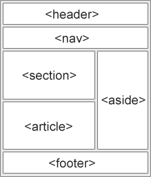
<header> - Defines a header for a document or a section
<nav> - Defines a set of navigation links
<section> - Defines a section in a document
<article> - Defines an independent, self-contained content
<aside> - Defines content aside from the content (like a sidebar)
<footer> - Defines a footer for a document or a section
<details> - Defines additional details that the user can open and close on demand
<summary> - Defines a heading for the <details> element
HTML Layout Techniques
There are four different techniques to create multicolumn layouts. Each technique has its pros and cons:
- CSS framework
- CSS float property
- CSS flexbox
- CSS grid
HTML Responsive Web Design
Responsive web design is about creating web pages that look good on all devices!
A responsive web design will automatically adjust for different screen sizes and viewports.
Setting The Viewport
To create a responsive website, add the following <meta> tag to all your web pages:
Example:
<meta name="viewport" content="width=device-width, initial-scale=1.0">
This will set the viewport of your page, which will give the browser instructions on how to control the page's dimensions and scaling
Responsive Images
Responsive images are images that scale nicely to fit any browser size.
Using the width Property
If the CSS width property is set to 100%, the image will be responsive and scale up and down
Using the max-width Property
If the max-width property is set to 100%, the image will scale down if it has to, but never scale up to be larger than its original size
Media Queries
In addition to resize text and images, it is also common to use media queries in responsive web pages.
With media queries you can define completely different styles for different browser sizes.
Example:
@media screen and (max-width: 800px) {.left, .main, .right {width: 100%; /* The width is 100%, when the viewport is 800px or smaller */}
0 comments:
Post a Comment